Real estate is an investment—make yours start earnin’.

In one of my graphic design classes, the professor asked everyone who their favorite graphic designers were. I mentioned Raymond Loewy, and was met with a puzzled face and a “I don’t know who that is.”
That was a shock to me, since I knew him as the designer of the Shell, Nabisco, Exxon, and USPS logos. Later I realized that Loewy–if he’s known at all–is more known for being an automotive and industrial designer. And unfortunately, he’s not as renowned as he should be in those fields.
When you think of automotive designers, you probably think of Harley Earl or Colin Chapman, but not Loewy. He was a graphic designer, an industrial designer, and an automotive designer. And he was damn good in all those fields. I mean, he literally wrote the book on Industrial Design. He was honored with a Google Doodle in 2013, which paid tribute to his work as an industrial designer. But he should be better known in all the design fields he worked in.
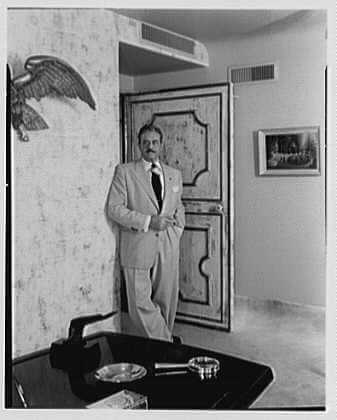
Raymond Loewy at his New York City office. Source: Library of Congress, Gottscho-Schleisner, Inc., photographer
Loewy was born in France in 1893. He served in the French army during World War I and then moved to New York in September 1919. There he found work as a department store window designer and as a fashion illustrator. In 1929 he completed his first industrial design project to contemporize the look of a duplicating machine by Gestetner. After that, Loewy did industrial design work for a Who’s Who of American companies from the ’30s to the ’70s: Frigidaire (refrigerators, ranges, and freezers), the interior of the Boeing 307, the Sears Coldspot refrigerator, numerous projects for the Pennsylvania Railroad (locomotives, the Broadway Limited, passenger cars), Sunbeam electric toaster, Electrolux L300 refrigerator … the list goes on and on.
Throughout Loewy’s industrial, automotive, and graphic design, his aesthetic was sleek, streamlined, and stylish. Loewy believed that consumers wanted the latest and greatest new things but were wary of things that were too new and advanced. Therefore, his design philosophy was expressed by the acronym MAYA, or “most advanced, yet acceptable.”
Loewy brought the same aesthetic to his automotive and motorcycle design. In 1932 Loewy designed the Hupmobile Hupp Model K cyclefender, followed by the Hupmobile 1934 Model J Aero-Dynamic. In 1941, he gave the Harley-Davidson 74FL Knucklehead a streamlined facelift. Highlights of his automotive design include the 1946 Lincoln Continental, the 1950–1956 Sunbeam Mixmaster Models 10 and 11, the 1959–1967 Sunbeam Alpine automobile, and a ton of Studebakers: the ’47 Champion, the ’53 Commander, and the ’62 Avanti shortly before the marque packed it in.
In fact, it’s possible that no client brought more acclaim to Loewy than South Bend-based Studie. Loewy persuaded Studebaker to set itself apart from the competition by offering lighter, more fuel-efficient cars, an uncommon idea for the era. He believed that there was an unmet demand for “a slender, compact automobile.” Loewy’s office in South Bend was covered with signs that read: “Weight is the enemy.”
At the time, he was 100% wrong. Later, he would have been hailed as a genius.
Harley Earl at General Motors (perhaps the best-known auto designer at the time, and the father of big fins) ridiculed Loewy as a “refrigerator designer.” However, Loewy’s 1938 Studebaker Champion was a success, followed by the 1939 President, which the American Federation of the Arts named “the best-looking car of the year.”
By 1950, Studebaker reached its apex, selling about three hundred thousand cars. The sporty 1953 Studebaker Starliner was widely praised and showed there was a market for a “personal luxury car,” paving the way for the Ford Thunderbird, Buick Riviera, and Chrysler Newport.
In 1961, Loewy designed the Studebaker Avanti, introduced in 1962. The fast, all-fiberglass car set twenty-nine speed records for a stock production car on the Bonneville Salt Flats in Utah. The Avanti was a hit with American car critics and buffs. It continues to be considered a highly collectible and sought-after classic automobile, and one of Loewy’s most famous designs. Loewy’s flowing streamlined shapes gave a recognizable look to cars from the 30s to the 60s. His design was infused in so many different products that there was almost a harmony to products of this era: a Sunbeam toaster would have similar design cues as the Studebaker Avanti, because Raymond Loewy designed both.
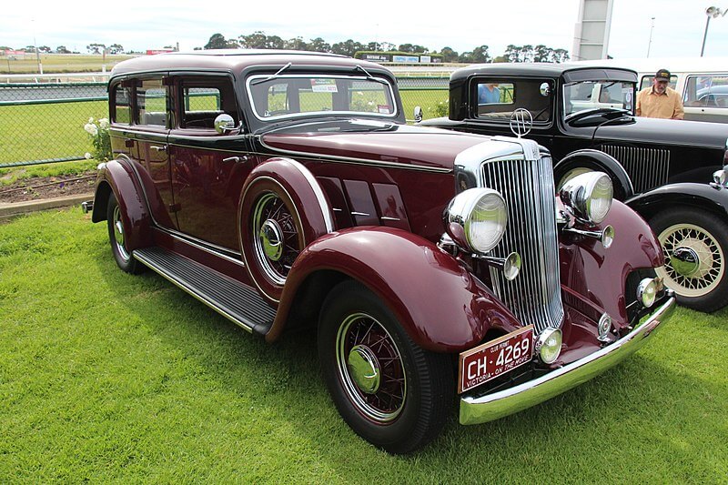
1933 Model K “cyclefender” designed by Loewy. Source: Sicnag, CC BY 2.0 <https://creativecommons.org/licenses/by/2.0>, via Wikimedia Commons
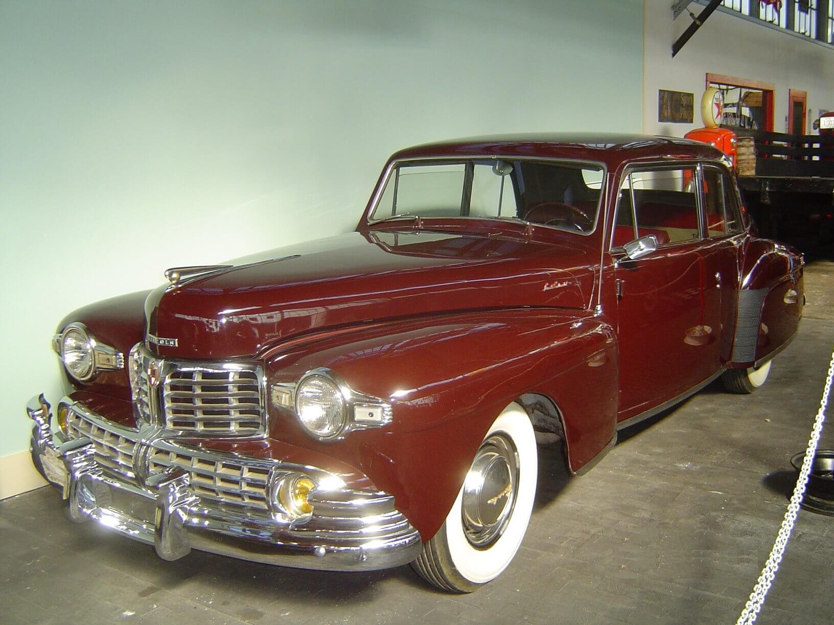
1946 Lincoln Continental. Source: Public domain, via Wikimedia Commons
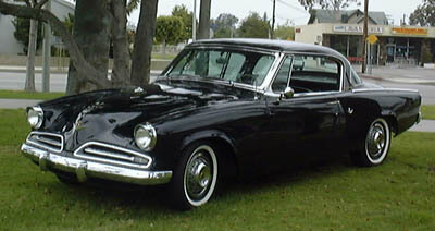
1953 Studebaker Commander Starliner hardtop. Source: User Morven on en.wikipedia, CC BY-SA 3.0 <http://creativecommons.org/licenses/by-sa/3.0/>, via Wikimedia Commons
All of this is already an impressive résumé, but now let’s talk about his contributions to graphic design.
In 1940, Loewy was asked by Lucky Strike cigarettes to improve their existing green and red package. Loewy changed the background from green to white, making the logo stand out better, as well as cutting printing costs by eliminating the need for green dye. He also placed the Lucky Strike target logo on both sides of the package, ensuring the logo would be face-up no matter how the pack was laid on a table, a move that increased both visibility and sales.
In 1935, the International Harvester company hired Loewy to overhaul their product line, from the company’s logo to operator ergonomics. Loewy’s design for their logo was an “I” and an “H”, positioned in such a way to suggest a farmer riding a tractor, referencing the company’s business.
He designed Air Force One’s blue, white and chrome livery (OK, maybe you could argue this falls under industrial design, but I consider livery to be more graphic than industrial design). He designed the TWA “Twin Globes” logo, the United States Coast Guard “racing stripe” service mark, the 1964 five cent JFK postage stamp, the Studebaker logo, the United States Postal Service eagle logo, and the Shell logo. And then there are the logos for Nabisco, United, Diamond Trust, BP, Canada Dry, New Man, American Chamber of Commerce in France … OK, I’m not going to list them all here because you’ll get bored, but you get the point. Hell, even Shell, Nabisco, Exxon, and the USPS still use Loewy’s logo design (or a version of it) to this day! As with Loewy’s industrial and automotive design, his graphic design was sleek, streamlined, and stylish.

International Harvester logo (1935). Source: https://www.carlogos.org/car-brands/international-harvester-logo.html, Public domain

The Exxon logo, designed in 1966, introduced in 1972. Source: Raymond Loewy (Vector graphics image by Crotalus horridus) This W3C-unspecified vector image was created with Inkscape ., Public domain, via Wikimedia Commons
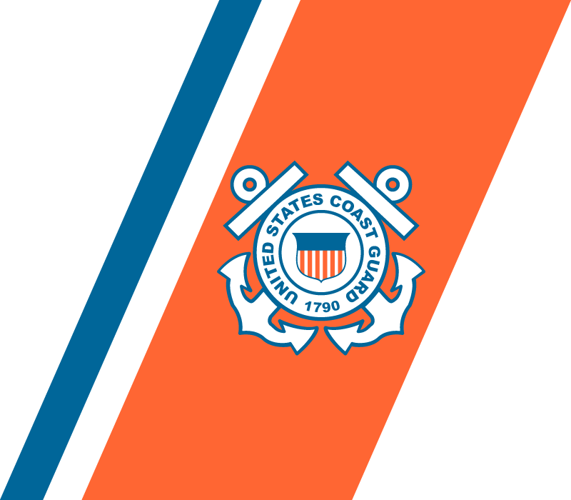
The USCG Racing Stripe logo (1964). Source: Eric.J.Hebert, Public domain, via Wikimedia Commons
So, what I’m saying is this: for his contributions to the look of early- to mid-20th century America, Loewy should be just as renowned as Frank Lloyd Wright. Perhaps this is a bold statement, but Loewy should almost be as well-known as an automotive designer as Carroll Shelby.
And, in my opinion, that renown should be due to his graphic design, just as much as it is to his automotive and industrial design. Maybe it’s because he was a jack of many trades that he isn’t as well-known. When you think of Frank Lloyd Wright, you think architecture. When you think of Thomas Edison, you think invention. Maybe it works against Loewy that there are so many different things that come to mind when you think about him.
Regardless, graphic design professors should still know who he is when you mention his name.
Do you have a favorite Raymond Loewy design? Or do you think I’m off my rocker?
The articles and other content contained on this site may contain links to third party websites. By clicking them, you consent to Dorman’s Website Use Agreement.
Participation in this forum is subject to Dorman’s Website Terms & Conditions. Please read our Comment Policy before commenting.