Customers don’t realize it needs attention. Sadly, many mechanics don’t, either.
The Most Neglected Part of the Cooling System
read more
Customers don’t realize it needs attention. Sadly, many mechanics don’t, either.
Warning lights are something we’re all familiar with—all too often, they’re the reason a customer steps into your shop. Mechanics of a certain age will remember a time when the phrase “idiot light” was used to describe a dash light. The derisive term referred to the driver who was unable to determine problematic readings on a gauge, which many feel provide more and better information when an undesirable event is occurring.
And as time has elapsed, warning lights have certainly proliferated. For decades, dash lights would tell you about your directional blinkers, a lack of oil pressure, a charging system fault, and if your high beams were on. Nowadays, however? There are a lot more of them, and the complex vehicle information they’re trying to communicate can leave even a pretty savvy mechanic stymied. Here, take a look at this video we made to see what I’m talking about.
Now, we made a bit of a joke out of this whole thing, but there is a serious element to this topic as well: At what point does the light stop being helpful? When mechanics and car buffs are seriously scratching their heads to determine what a car is trying to say, maybe a simple message on an information center is the better option.
If you ask me, the problem actually has a few contributing factors. I think potential solutions are manifold, but the factors affecting this issue are compounding.
A skeuomorph is an object that retains design cues that were necessary in a past iteration. In that sense, it’s a bit like an anachronism, an object seen outside its natural place in time. (Anachronisms are classically thought of as a modern item that’s chronologically inconsistent, like the Starbucks coffee cup seen in an episode of Game Of Thrones, but technically it works the other way, too. Older items can and do survive through history, but a later item can’t readily go back in time, which is why new objects in an old setting seem more glaring.)
An obvious example of this is the Check Engine light I’ve written about before. The icon of the engine retains design features no longer found on most modern engines. But there are other instances, too. Nearly any brake-related warning lamp will show a drum and shoes, despite the fact most vehicles rolling out of factories today are wearing at least one set of discs if not two. (And the system as depicted shows an external drum brake, an even earlier and less-relatable form of stoppers fitted to automobiles in the ‘20s.)
Isn’t it understood that motorists would have trouble interpreting an automotive feature last seen 100 years ago? Most drivers wouldn’t even be able to identify a modern caliper and rotor setup; assuming they can identify even older tech just seems hopeless to me.


Brake warning lights.
This is an easy, obvious problem to identify. Cars aren’t the simple transportation they once were. For example, the left turn signal icon is easy to understand. It is a flashing arrow to the left. It conveys a simple concept: the vehicle is moving this-a-way.
Something like “the DPF is clogged” or “the vehicle has an adaptive chassis suspension fault” are much harder to communicate in a simple pictograph.
DPF and adaptive chassis suspension fault.
The final contributing factor in the United States is the Federal Motor Vehicle Safety Standards (FMVSS), governed by the National Highway Traffic Safety Administration. Specifically, FMVSS 101 (“Controls, Telltales, and Indicators”) is the section of the law that deals with idiot lights. The regulation here isn’t necessarily draconian, but it is somewhat evident legislation has been added over the years to clarify things that may have yielded some unintended consequences.
For instance, there are four subtly different icons that all deal with the front windshield. (“Windshield wiping system,” “Windshield washing system,” “Windshield washing and wiping system combined,” and “Windshield defrosting and defogging system” all look pretty dang similar.) Side-by-side with an explanation it’s pretty understandable, but a lone telltale illuminated on the dash may not be so easy to understand.


Now it should be noted the FMVSS for those items actually deals with depiction on the control, not the telltale (the light) but in what I assume is an attempt at efficiency and consistency, that same image is usually duplicated on the dash or in the message center.
The regulatory body does highlight what needs to be used on lights and what needs to be used on controls, but it seems the idea of manufacturers voluntarily keeping symbols consistent wasn’t taken into account because it wasn’t immediately obvious they’d do this.
User Experience and User Interface are fields of study at this point. It seems to me as though UX research should have a more prominent place in automotive design. For instance, “press brake” lights are usually green, and “press clutch” lights yellow. However, this violates one of the functions of almost all vehicle warning lights, which is that red lights convey the need for immediate attention, and yellow lights a less-pressing situation. White, blue, and green lights simply communicate that something on the car is in use.
So it’s no surprise that the green “press brake pedal” light and yellow “press clutch” light trip up even seasoned wrenches: the UX isn’t great. Other examples certainly exist—are black-and-white vehicle message centers that display these images but stripped of their color really helping the motorist, or are they obfuscating what should be a clear message? Technology should have won out here, but perhaps a black-and-white message center fails where simple colored light bulbs win out, perversely.


Press brake pedal and clutch icons.
There are a lot of ways to skin this cat. I’m a fan of the “message center” approach, or information center—the area where text is used to better communicate more complex ideas. “Oil change due in 200 miles,” for example, is probably best communicated via text. There’s a certain urgency (or lack thereof) that should also help determine how information to the driver needs to be prioritized.
Another solution is one I employ when building custom stuff, and that’s simply putting the operating switch and indicator light within the item being operated. Obviously that doesn’t work for every single item in a vehicle, but it could help cut down on some of the information overload. To wit: A 4WD light is just fine, but a T-case lever shoved all the way forward as the knob on top indicates is a more elegant solution in my opinion—a motorist can see that out of the corner of his eye, and the added experience of interacting with it drives home the point.
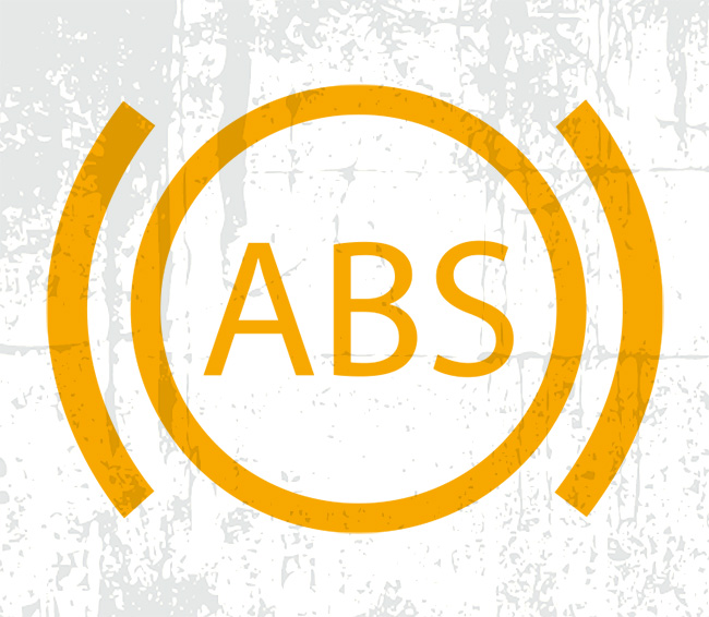
Finally, I might add that perhaps not every single piece of information really needs to be conveyed. Not just pictorially, I mean at all—sure, knowing that ABS just malfunctioned is pretty helpful, but does a motorist really need to know that the low beams are on in a car equipped with DRL’s?
Of course, tech can help solve these problems with text, audio, and haptic helpers that go beyond the visual cues offered by the idiot light. However, that presents challenges on the legal front as the guidelines that have been in place for a long time would have to be overhauled and adapt quickly to changing circumstances with how automakers present information to drivers.
Hopefully as technology becomes more prevalent (and better researched) within vehicles, some of this complexity vanishes. Simple solutions for complex systems, after all, are the hallmark of elegance—and who doesn’t want a more elegant ride?
The articles and other content contained on this site may contain links to third party websites. By clicking them, you consent to Dorman’s Website Use Agreement.

Pocket check!

Car thieves are getting smart. You need to be smarter.
Salt isn’t so good, but for many vehicles, a little pepper goes a long way.
You probably see them every day, and that’s by design.

An attempt at improving driver safety might not have worked as intended, but it sure gave a distinctive look.
A nationwide framework of safety regulations has transformed vehicle design and saved countless lives since its introduction in 1968.
Participation in this forum is subject to Dorman’s Website Terms & Conditions. Please read our Comment Policy before commenting.